Friday, June 24, 2011

Happy Colors | Purple

I recently asked the Beautiful Habitat Facebook friends “what color make you happiest?” It was meant to be a Friday brain-break, but the answers inspired me to include their happy colors in a few blog posts. My philosophy has always been to follow what you love to inspire your interiors. If a color makes you happy, use it in your home. This can be intimidating, but I hope these Happy Color posts will inspire you to find ways to incorporate your own happy color into your home decor.
Today we’ll take a look at purple in interior design and decorating.
A Little Purple
Purple is a great accent color. Try purple in throw pillows, vases and accessories, artwork, window treatments, or perhaps a small table or accent chair. Use it to spice up neutrals, or in combination with another bold color.

Both above via Belle Maison


A Lot of Purple
Purple works equally well in large doses. These rooms take purple all the way. Here think wall color, bedding, and larger furniture… or all of the above.
 via Afflatus

Via House Beautiful and also featured in the previous post An Ode to Banquettes

 via Afflatus


 In reality, you may be living with someone that doesn’t love your happy color as much as you do.  But there are still ways to bring in that happiness with out a huge commitment. Try some purple flowers in any room.

 What color makes you happiest? Do you use it in your home? Share with us on Facebook and look for more Happy Colors posts coming soon.

Beautiful Habitat: Interior Design & Decoration www.beautifulhabitat.com

Monday, June 20, 2011

Love it of Leave it | Patterned Bedrooms

I have long been a fan of Interior Designer Mary McDonald. I admire that she takes risks and is bold in her work and, as a result, the interiors that she creates are absolutely stunning.  In this particular room, she breaks all the conventional rules of bedroom design by creating a space with bold red on red color and pattern on pattern.
We read it, hear it and see it all the time – a bedroom should be a soothing sanctuary. Calm colors, muted patterns. Restful. This room is the absolute opposite.

Red is an energetic color. Green is also used in the room and is opposite of red on the color wheel, making it a complimentary color. Using complimentary colors together traditionally creates even more energy in a room.
Then we have pattern on pattern with bold stripes and the geometric wallpaper. These features combined, make for a high energy, but still aesthetically pleasing room.
All the rules have been broken in this bedroom, but I want to know what you think. Do you love it or leave? Could you and would you sleep in this room?


Beautiful Habitat: Interior Design & Decoration www.beautifulhabitat.com

Wednesday, June 8, 2011

Framed Objects as Wall Art {Guest Post}

Many of us can’t help but frown at an empty wall yet struggle with what to nail upon it.  Family photos and copies of a Van Gogh have their merits, but the latest trends in framed art lean more toward the abstract.
DIY nuts and flea market aficionados can rejoice, since few things—aside from Mona Lisa—look better in vintage frames than vintage finds.  For example, one can arrange children’s vocabulary flashcards with one’s tongue in cheek or to quote Shakespeare.  The effect is stark but retro.  Alternatively, old skeleton keys make great accessories—think necklaces and key ring charms—but they also look great hung on walls or arranged in a frame.

 Credit: Design Sponge

Credit: Design Sponge

Three-dimensional objects may not suit a glass-covered picture frame, but they take abstract home décor to a new level (dimension?).  Seashells suit anyone living near the shore  and flowers in vases add a touch of living beauty to any room with vintage appeal.


Credit: Susan of Seaside Shells


 Credit: thinkofthe


Before there were color photographs, there were family silhouettes.  Rather than displaying plain black shadows (and risking blowing in an eerie air to an otherwise elegant space), consider buying silhouettes made from pretty wallpaper.  Victorian designs produce a delightfully quirky effect.  Making your own is easier than you might believe.


Credit: Design Sponge

In this fashion, handmade paper art can add flair to a room that no print or copy from a museum or exhibition can.  Consider the array of butterflies—cut from pages of an old book—on Jennifer Rizzo’s wall and the neatly arranged paper (and button) hearts by Nicolette Tabram.


Credit: Jennifer Rizzo


Credit: Nicolette Tabram

For multi-media art, these shadow boxes provide plenty of wiggle room.  Place anything from an old deck of playing cards to a stack of poetry books inside with one quirky flea market find and you’ve made art.  These, from Design Sponge, are made with wine crates.


Credit: Design Sponge

Bio: Tracy Sitchen is a veteran coupon clipper, stay at home, and aspiring writer. While she loves shopping, she loves the chase of the deal even more! She’s recently been writing on Heinz ketchup coupons and printable Friendlys coupons over at her blog where she shares deals and discounts to help every day people save money.


Beautiful Habitat: Interior Design & Decoration www.beautifulhabitat.com

Green Home Design in Denver

Each year, HGTV searches for  a leading “green” community and local builder to showcase the latest and greatest in sustainable home design.  This years Green Home is in the Stapleton redevelopment area of Denver, Colorado.  Being a Denver Interior Designer, I was in line to see the home as soon as it opened up to tours last week.
Before we get to the highlights, a few quick notes about the Stapleton redevelopment area for those who aren’t familiar with Denver. Stapleton is the old Denver airport, which was replaced by the Denver International Airport in 1995. In 1990, the Stapleton Redevelopment Foundation was created to determine best uses for the 7.5 acre site. The vision: community as a “Neo-Urban Lifestyle.” A blend of the best of the urban with the best of the suburban: convenient, accessible and cultured along with safety, outdoor space and a clean, family community. 30 percent of the space would be reclaimed into open green space, parks and nature preserve. And, town centers with grocery stores, restaurants and retail would crop up next to homes,  making for a walkable and outdoor-driven community. For more visit StapletonDenver.com or HGTV.
What’s green about the Denver HGTV Green Home?
  • LEED (Leadership in Energy and Environmental Design) Platinum Certified  by the US Green Building Council. (LEED Platinum is the highest green certification out there).
  • HERS (Home Energy Rating System) score of 38, when most homes built to code today score 100 (lower is better, in case you hadn’t already sorted that out)
  • Energy Star certified
  • Significatn recycled and reclaimed content including beetle-kill wood and pieces recycled from the former airport
  • Built with locally sourced materials whenever possible
  • Solar energy system providing 75% of home’s electricity
  • Most furniture and accessories made with eco-friendly fabric and materials
  • Most artwork is original work by local artist and purchased at local shops and galleries
Now the highlights of the interior design and decoration…
Entrance/Front Yard
My favorite piece here is the retaining wall. Not only does it add an interesting texture in the landscape design, but it is made from the blast screen that used to be between the old airport and the highway. That is clever and beautiful reuse! Other Eco-friendly features include the xeroscaping and a permeable walking surface that captures and redistributes the water.
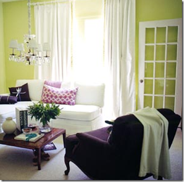
Denver Interior Design
Great Room
The overall interior design of the home is smaller, with a focus on natural light and smart, functional, and multi-purpose spaces. Do more with less. The living room, kitchen and dining rooms are all open to each other. It’s compact, but very functional design. The interior decorating is fun, with a focus on eco-friendly products all sourced from Denver resources.
Living Room Interior Design ColoradoYes, that is a chair made of reclaimed radiators. No, I was not allowed to sit in it and do not know if it is comfortable. If not, at least it’s interesting artwork and 100% recycled.
Custom Funriture Denver ColoradoCustom Kitchen Denver Colorado
“Do” Room
This multi-purpose room features laundry, and three separate pull-out, hide-away work stations. Again, it’s a compact, but highly functional interior design plan.
Colorado Interior Designer
Upstairs Loft
The upstairs loft area is another comfy family room with great natural light and views. It’s an ideal place for kids or adults. Great local Denver art adds fun and color to the interior design plan.
Colorado Interior DecoratorThere are 3 bedrooms, 2 bathrooms, a loft and a nook/office space upstairs. Check out the online tour for more photos of the spaces not seen here.
Master Suite
In place of a traditional headboard, the entire wall of the master suite is clad with pine beetle-kill wood. It doesn’t feel rustic, but adds a great reclaimed natural element to the room. All Interior doors in the home are also reclaimed beetle-kill wood and they are beautiful (see below).
Colorado Interior Decorator
My Favorite Design Element
This door is to the master bath. Look closely and you’ll see a motion detector in the upper corner of the door opening. This motion detector senses when the bathroom door closes, then starts heating the water for the mater bath. No waiting for the hot water to reach upstairs, wasting gallons and gallons each day.  Brilliant! From the decorating standpoint, I really love these sliding “barn-style” doors and the frosted glass, which continues to let natural light flood the whole home.
Denver Interior Decorator
Outdoor Spaces – Front and Back
Both the front and back yards feature large seating areas to enjoy the Colorado weather and views.
Colorado Interior and Exterior DesignDenver Interior Designer
If you can see the home in person, it’s well worth the time and money and all proceeds go to a Denver charity, Urban Peak. Urban Peak helps homeless youth and those at risk of becoming homeless to overcome real life challenges by providing essential services and a supportive community, empowering them to become self-sufficient adults.
Can’t see the Green Home in person? Take the virtual tour.
What’s your favorite part about the Denver Green Home?

Beautiful Habitat: Interior Design & Decoration www.beautifulhabitat.com

Friday, June 3, 2011

Designer Tips: Using Bold Wall Color

Most people shy away from bold wall colors. They can be intimidating. They can also be truly striking and take a room that is “nice”to one that is absolutely jaw-dropping.
House Beautiful magazine is covering the transformation of the Bee Cottage, focusing on a room each month. The Guest Bedroom Makeover provides a great example of many tips and tricks that Interior Designers use for selecting and using bold paint color. The guests who stay here will be blown away by the beauty of the room.

One surprising fact is that this room is tiny – about 9′ x 12′, with 7′ ceilings. Conventional rules say that painting with a dark color will make a room feel smaller. Obviously, this room breaks that rule in a glorious fashion. So, why does it work here? From House Beautiful, “Deep tones absorb the light, decreasing shadows so the space appears seamless and therefore larger.”
Another important key in this room is that the ceiling is painted in the same color as the wall. It’s no secret that I am a big fan of painted ceilings. In this particular bedroom, painting the ceiling makes it virtually disappear. Look at the room again and just imagine the ceiling white. Your eye would immediately be drawn up to the ceiling. A white ceiling would make the room feel small and low and would emphasize the awkward angles of the space.


Another tip in the success of this Interior Design plan is the balance of color. The walls and ceilings are the largest surfaces in the room and are in the bold turquoise-y color. The second largest surfaces are the floor and furniture. These have all been kept very neutral so as not to compete with the wall color. The result is a balanced space that does not overwhelm.

 The addition of a few bright red accessories adds a perfect level of interest to the room. Without this punch of color, it would be just a little flat. The red could have easily been replaced with yellow, green, orange, or any other color. For a great example of a room that employs these same Designer tips with a turquoise and tangerine scheme see the post Now That’s How You Use Color.


The Bee Cottage guest bathroom got an equally bold paint treatment. Without changing the flooring or fixtures in the room, the addition of paint on the walls and ceiling breathes new life into the room at minimal expense.
Before
After

Beautiful Habitat: Interior Design & Decoration www.beautifulhabitat.com

LinkWithin

Related Posts with Thumbnails